The Half-Earth Project Map is getting a major update to improve user experience and provide a finer resolution (~27.5 km), just ahead of Half-Earth Day. The Project Map is a high-resolution, dynamic world map and decision-support tool that guides where place-based species conservation activities are needed the most to save the majority of global biodiversity. It is used by scientists, ecologists, conservationists and community leaders, students and teachers to explore area-based global biodiversity. The Project Map is informed by the research of the Map of Life at Yale University, designed by Vizzuality, and powered by ArcGis, Esri technology.
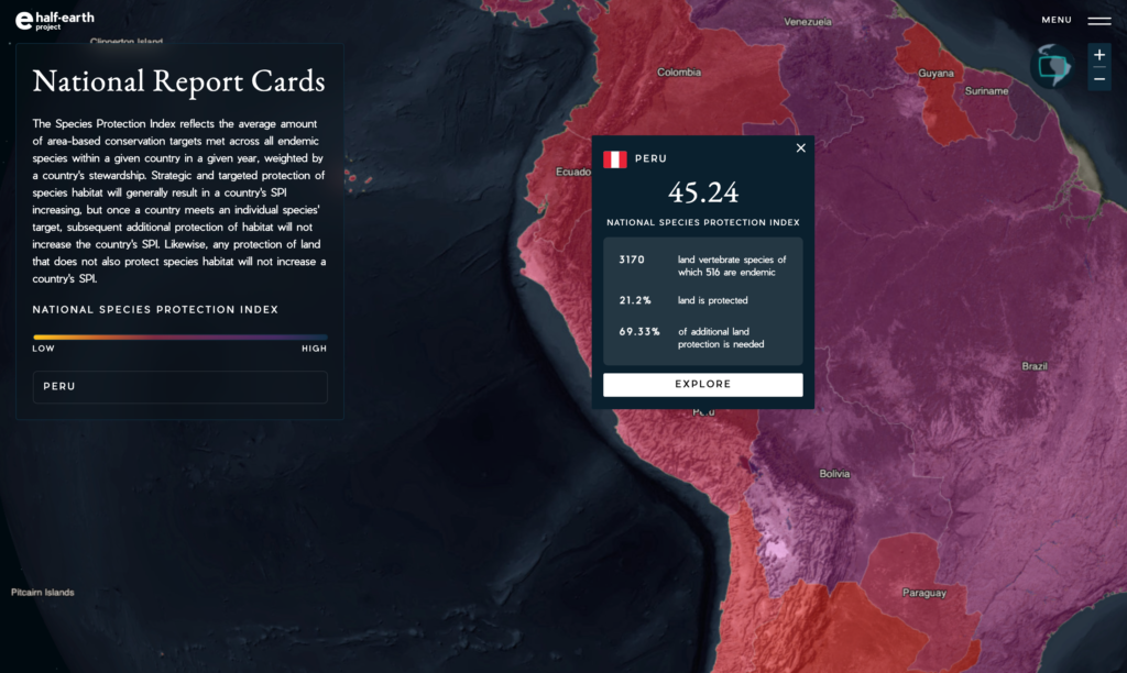
The map has new biodiversity layers, new color ramps, and an updated menu and new color ramps, and a new way to access National Report Cards. National Report Cards National Report Cards and Species Protection Index, which help to measure how many species groups are protected by each country’s conservation efforts, focusing at the national level on how conserved places are protecting the species within them.
On Half-Earth Day, Scott Rinnan (Yale University), Sean Breyer (Esri), Susana Romao (Vizzuality), and Craig Mills (Vizzuality) will inspire you to think about how technology, data, science, and design will help us reach our goal of Half-Earth.
New biodiversity layers
- The biodiversity layers (richness, rarity, priority patterns) have been updated to a 0.25˚ resolution (~27.5 km), representing a fourfold increase in resolution from the previous versions. The new terrestrial layers are derived from species ranges refined by known habitat associations, which increase the spatial accuracy of range maps. The new marine layers now feature patterns of marine mammal richness and rarity, as well as priority patterns for fish and mammals.
New color ramps
- The data on the map has new color palettes that are meant to help the user focus on what is important and understand it more easily. We enhanced the visibility of the priority layer hotspots – so these can really stand out. We have also changed the color palette of human pressure layers to convey a greater sense of urgency. For that, we are now using warm colors (purple to yellow) instead of the previous pale violet scale. Finally, we have unified the color of the Protected Areas layer so as to make it consistent throughout different sections of the map (eg. Explore map and NRCs), and intuitive forest green color.
Updated Menu
- The user can now navigate across the different map sections through a menu. It helps to quickly access different maps and also provides links to the project social media and sharing functionality.
National Report Card Access
- National Report Cards can now be accessed through a specific URL and can be selected from a globe showing the different countries’ SPI.
- The maps in the National Report Cards have been updated to reflect the new terrestrial biodiversity layers.